DH-150
Co—Star
DH150 UX Design, Jasdy Perillo
About the Project
This project focuses on the mobile app user experience for Co—Star, an app that aims to foster a community interested in astrology. Astrology is a unique topic of shared interest because its community doesn’t really have physical spaces in the real world where people regularly meet or have easy access to. I chose the Co—Star app because astrology is quite popular among young demographics, including my fellow college students, and I saw this as an opportunity to improve the engagement and retention of users on the app.
Clear design statement:
The main issue with the Co—Star app is that its interface is not intuitive enough. Accessing certain features or information can be quite difficult on the user’s end, which is important to fix for an app like Co—Star which relies heavily on written text as its main content as opposed to images, videos, etc. Astrology in particular poses unique challenges because it is always changing: a person’s horoscope is different every day as the planets and stars move and change position in space. As a result, astrology can often times feel overwhelming because of how dense the information is. Throughout my project, my objective was to streamline the user experience as much as possible in order to maximize the accessibility of the astrological information and services provided by the app.
Heuristics evaluations and usability testing [assignment01 & 02]:
Co—Star App | UCLA SafeRide App
————|——————
 |
||
I chose the UCLASafeRide app because I am part of the community who uses the app—the UCLA community. I think it’s important that services like UCLA Safe Ride exist because it contributes to the safety and accessibility of life at UCLA for students, faculty, staff, and more. To me, apps like UCLA Safe Ride are crucial because they contribute to the UCLA experience. For example, I can catch a van ride back to my apartment after a late night meeting on campus with my roommates or friends. I can use it to go visit Ralph’s where I sometimes do my grocery shopping. This app shapes how I, and many fellow students, experience UCLA, because without it, I might not be able to attend on-campus events at night, given how far I live. The service that UCLA Safe Ride provides is integral to the UCLA community.
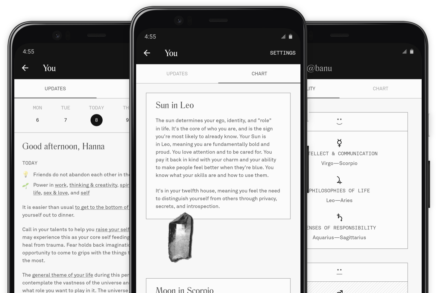
I chose the Co—Star app because it’s a pioneer in its ‘field.’ Co—Star was one of the first apps developed that gained popularity because it did more than provide users with information about astrology and their personal birth charts. Users can compare their birth charts and daily horoscopes with those of their friends. Co—Star even provides a compatibility ‘diagnostic’ that analyzes a user’s astrological compatibility with a friend. The app makes astrology more accessible and its inherent design and mission is to allow users to foster and strengthen the sense of community that they share with those in their lives. Read more about my heuristic evaluations of the Co—Star app and the UCLA SafeRide app.
The Co—Star app provides users with insight into their astrological identity through daily in-depth horoscopes. It also serves as a platform for users to interact with friends by offering compatibility evaluations based on their birth/natal charts. I conducted a usability test, during which I documented both the participant’s live interactions with the app via a screen recording of the user’s iPhone, as well as the participant’s facial and verbal feedback through ActivePresenter. Using Jakob Nielsen’s 10 Usability Heuristics for User Interface Design, I identified and analyzed usability problems during this phase of the project. Read more about the results of my usability test of the Co—Star app.
User research [contextual inquiry, assignment04]:
The Co—Star app’s purpose is to deepen users’ knowledge of their own astrological identity, as well as establish and strengthen their relationships with people in their lives who share their interest in astrology. In order to support and facilitate these functions, I executed a contextual inquiry to learn more from an existing user of the app and gain insight into any shortcomings in the functionality of each of the app’s features. Read more about how I conducted a participatory observation/interview.
UX storytelling [persona + scenario, assignment05]
I identified personas of three likely users of the Co—Star app: Ashley, Grayson, and Lauren. These three personas represent the various circumstances and motivations a person may have for using the Co—Star app. I proceeded to develop three possible scenarios wherein the app would facilitate a solution to a problem that Ashley, Grayson, or Lauren might face in the real world.
| Persona 1: Ashley |
|---|
| Persona 2: Grayson |
|---|
| Persona 3: Lauren |
|---|
Read more about potential scenarios that the Co—Star app aims to facilitate.
Wireframe and graphic design element variation [assignment07 + part of 08]
These initial sketches show the process of logging into the Co—Star app and how a user would access their birth chart and account settings. If the user has an account, they will be immediately directed to their home page where they can access their list of friends, add a friend on the app, and view their birth chart.
View my graphic design element variations.
Low-fidelity prototype (wireflow, assignment06)
The objective of developing a low-fidelity prototype and testing the wireflow is to document the flow of three key features of the Co—Star app. The prototype displays what pages a user will encounter as they perform each of these three tasks, and the wireflow documents how a user would navigate the app. Low-fidelity prototypes are useful to see how the user thinks when presented with a potential solution, and allows people like me to observe how the user thinks and logically map out how the new features will behave. Learn more about testing the wireflow of my low-fidelity prototype.
High-fidelity prototype (functional/interactive prototype, assignment08)
Through user research, evaluations, and feedback, I have created a high fidelity prototype which visualizes my re-design of the app. Incorporating what I’ve learned and discovered in earlier weeks, I implemented changes to the app’s current design to hopefully improve user experience and increase user engagement. Learn more about my high-fidelity prototype.
View my interactive prototype.
Pitch video

Conclusion: what did you learn throughout the process?
This process was such an eye-opening learning experience. Throughout each phase of my project, I learned that what I—and many others—intuitively notice about an app or website come from an instinct that we should trust and lean into. While I would have loved to continue developed a more refined high-fidelity prototype, I am grateful for the opportunity to learn about web/app design, especially in regards to accessibility. In fact, ever since covering color and font accessibility, it has become the first thought in my mind whenever I go onto a new website or download a new app. Most importantly, what I learned to love about the process is that truly, in UX/UI, there is always room for improvement, which is something I really admire about the field.